MyTutor
DBS upload page re-design
✏️ Independent re-design project
🕐 1.5 months (August - September 2024)
📄 Page where user uploads document
Problem
MyTutor throwing away over 4k per year due to time spent rejecting incorrect DBS uploads which do not meet requirements.
Solution
Newly laid out page making DBS requirements crystal clear and clear information on update service.
Outcome
Qualitative data showed a showed a significant increase in knowledge and understanding of MyTutor's DBS requirements.
Context
Intro
MyTutor's mission is to make life-changing tutoring accessible to all students, regardless of their background.
The platform aims to provide high-quality, personalised online tutoring that helps students achieve their academic goals and build confidence in their abilities.
To work with school children, all tutors must have an Enhanced DBS check. During their onboarding, tutors can either upload a DBS check that they already have, or apply for one through us.

The current process
📄 Tutor uploads their own DBS —> On daily basis, my team in charge of checking
✅ Meets requirements —> DBS status updates to approved & expiry date recorded on profile
❌ Does not meet requirements —> DBS status updated to awaiting upload & tutor emailed —>Tutor able to upload again, or through us.
Feb 2023
🤦🏼♀️ I noticed a huge spike in tutors uploading a DBS which did not meet requirements.
💡 Took on a side project to look at ways we could improve the upload page.
🤦🏼♀️ Test proposal never went live due to other priorities.
Side project steps (leading to test which never went live)
I ran a workshop on the tutor onboarding flow, focusing on clarifying DBS requirements and the update service’s value. Stakeholders from customer service, product, marketing, and operations aligned on key issues, identified gaps, and agreed on quick wins.
As a quick win, we updated the copy in onboarding emails, which led to a slight decrease in DBS-related queries. 🎉

DBS upload page problems
My main focus was the DBS upload page. Here are the key issues we spotted which could lead to confusion.
Misleading title
Random quote from student which has nothing to do with uploading or getting a DBS.
Typo —> Missing 'with' school students, limited guidance to help tutors know where to click.
No link to FAQs or reference picture on what DBS should look like
Greyed out submit profile button which would always cause confusion
Lack of info around the update service

Preparing test for A/B Tasty
I used the workshop insights to tweak the DBS upload page with A/B Tasty, a tool for running quick A/B tests to improve digital experiences. I got feedback from colleagues and the test was ready to go, but priorities changed and it never went live.
💡 IF THE TEST HAD GONE LIVE, we would have split onboarding tutors between the updated page and the original, and I would have monitored the following metrics:
📊 DBS contact volumes
The less contacts we get, the more money we’re saving!
⚠️ DBS upload error volumes
The less errors we see, the quicker a tutor is through this hoop, and the less time we have to spend contacting them
🎓 Tutor conversion rates
The quicker a tutor converts, the more likely they are to provide quality lessons
⏱️ Time spent on page
The less time a tutor spends on this page, the quicker they’ll become live
🔻 Drop off rates
If tutors drop off, it could mean there’s too much information?
✅ Correct selection of update service
This means less back and fourth for us, and we can be confident this tutor’s DBS will continually renew.
This would make a good case study
Fast forward to August 2024, and I'm sat thinking about which case studies to include in my portfolio. Although I had already moved on from MyTutor by this point, that dreaded DBS page was still looming in my mind.
"This would make an excellent case study!" I thought.
Let’s take the original ideas beyond copy tweaks in A/B Tasty and use Figma to reimagine the DBS upload page design.

Research & Planning
Understanding the problem
Based on data and feedback from customer service and tutors, we've identified that unclear instructions on the 'Apply for a DBS check' page during onboarding may cause tutors to upload incorrect documents and mistakenly select their update service status.

“I have now re-uploaded a copy. To be honest I found the application page quite confusing and think it would be helpful if the guidance was more informative. Not everyone will know what a DBS is meant to look like or what the DBS update service is.”
- Tutor, Jan 2024
Why is this important?
If a tutor uploads a DBS that doesn't meet the requirements, we must manually contact them to re-upload, which delays their onboarding and increases the risk of churn.
If they don’t understand the DBS update service, they may select the wrong option, leading to more work and higher costs.
Since most tutors drop off at the DBS stage, it's crucial to make the process as clear and informative as possible to ensure they submit the correct document on the first try and correctly select update service option.
The problem, validated by some data

This pie chart shows the breakdown of reasons why we were rejecting DBS uploads over January and February 2023. Please note these numbers are not exact but help paint the picture of the problem.
Let's talk cost to serve
I ran some rough calculations and found that, on average, we were checking around 1,500 new DBS checks each month. I factored in the hourly salary of a customer service exec and the time it typically takes for tutors to rectify mistakes and upload a new document, and the results were eye-opening...
MyTutor potentially throwing away at least £380 per month due to unclear DBS upload page, that's over £4k per year!
The hypothesis
We believe that adding clear, helpful guidance to the Upload DBS Check page will…
⬇️ Reduce the number of incorrect DBS uploads by tutors
📈 Increase sign-ups for the Update Service, and
💡 Improve tutor confidence and understanding of DBS requirements.
We'll know this is true when…
✍️ The admin team rejects fewer DBS checks
📈 More tutors sign up for the Update Service, and
🗣️ Feedback from tutors shows improved clarity around DBS requirements.
Constraints & Considerations
My designs couldn’t be tested on real tutors as I left the company.
Initial success metrics constrained to results of my own mini experiments as designs never actually rolled out.
I wanted to deliver a short experiment to gain insights and get quick wins, so just focused on one page and didn’t stray too far from original design
My success metrics
📈 Increase in knowledge and user confidence around MyTutor's DBS requirements.
📈 Increase in understanding about what the update service is.
I'll measure this by showing users the original page and asking questions, then showing them 2 other variations of the page and asking the same questions.
Design
Competitor Analysis
Competitor analysis was challenging because for most of these products you need to have gone through onboarding / interview to be released onto portal where you upload documents.
To get around this, I looked at FAQ pages and also used Mobbin!

Wise app, Preply, Tutorful
Key observations
👍 Check box bullet points of documents required
👍 Links to FAQs
👍 Summary info boxes
👍 Modern, clean interfaces
🎓 Tutorful proved to be most insightful because it was the most similar to how MyTutor's page is laid out.
FAQ deep dive

I looked at the current MyTutor FAQs to review essential information about the DBS upload process such as requirements, steps, and guidelines. This helped me understand what information is already out there for tutors and ensured my re-design aligns with existing policies.
💡 There was clear information over all, but more of it needed to be on the upload page itself.
💡 Table view was helpful for viewing information.
💡 Info about the update service, but how would tutor know if they've signed up?
💡 Date of issue not clear on upload page.
Ideation
Data revealed that the vast majority of tutors use desktop devices to upload a copy of their DBS, as the task involves locating and submitting documents—a process better suited for larger screens.
Because of this, I prioritised designing for the desktop breakpoint to optimise their experience.
Considering I wanted to carry out a short experiment to pin point some quick wins, I used competitor analysis as inspiration and quickly mocked up 3 design variations.
All options include more information at the top, split into manageable chunks to prevent information overload.
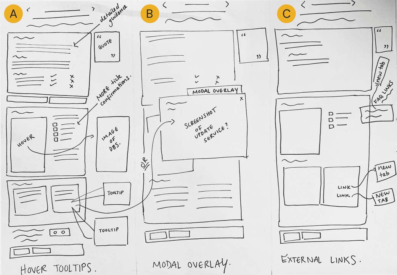
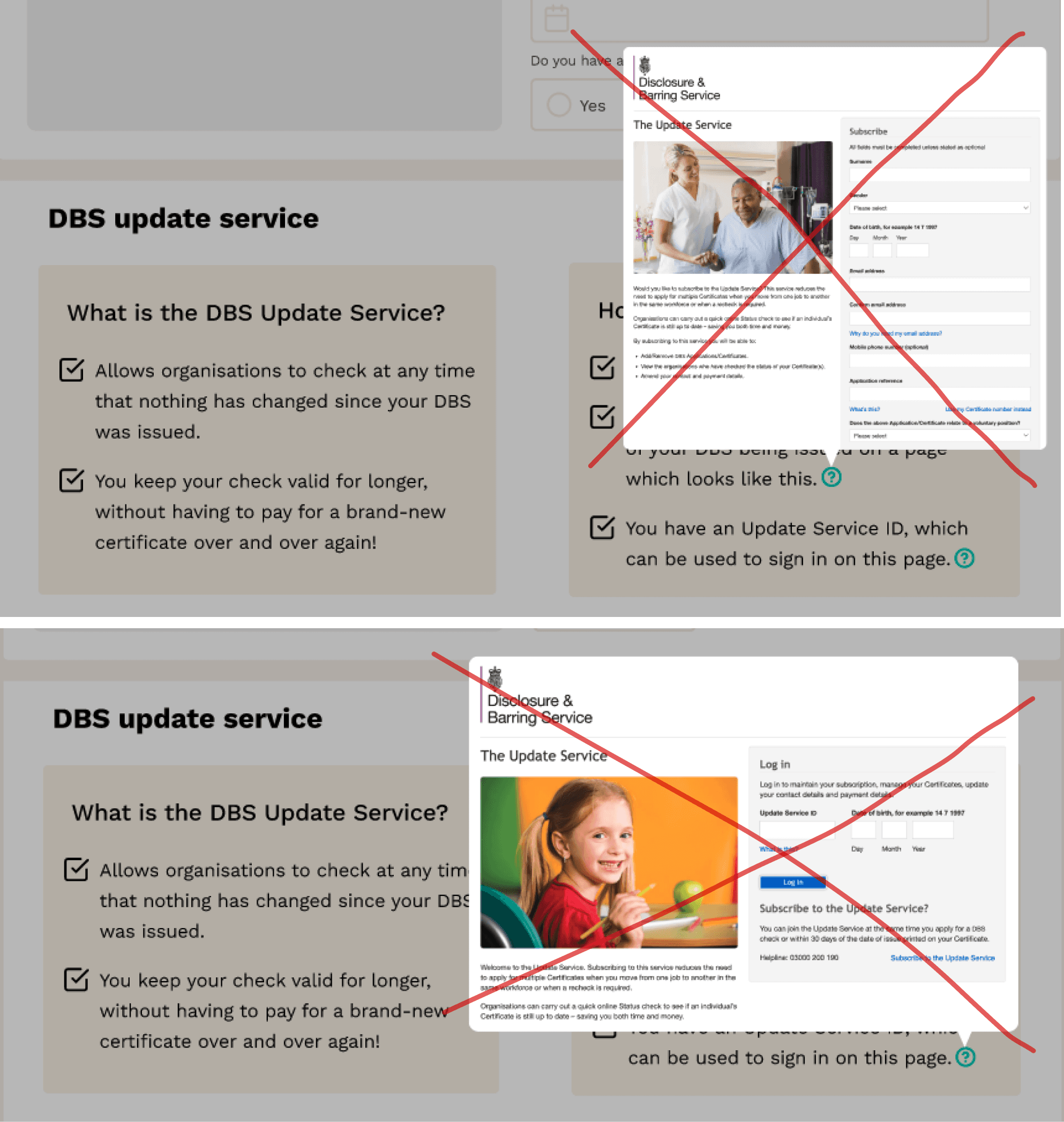
A) Hover & tooltips
User hovers over upload box and image of what DBS should look like comes up.
Tooltips on what the DBS update service looks like pop up.
B) Modal overlay
User clicks on text / icons and modal overlays pop up
C) External links
User naviagtes to external links of FAQs & DBS update service web pages
In design, it’s advised to avoid opening new tabs during onboarding to reduce user drop-off.
However, since the DBS check is an external process, Variation C tests whether providing access to official FAQs and update service links enhances understanding.
If it performs well in testing and is rolled out, I would monitor drop-off rates to ensure tutors return to complete the process after reviewing the information.
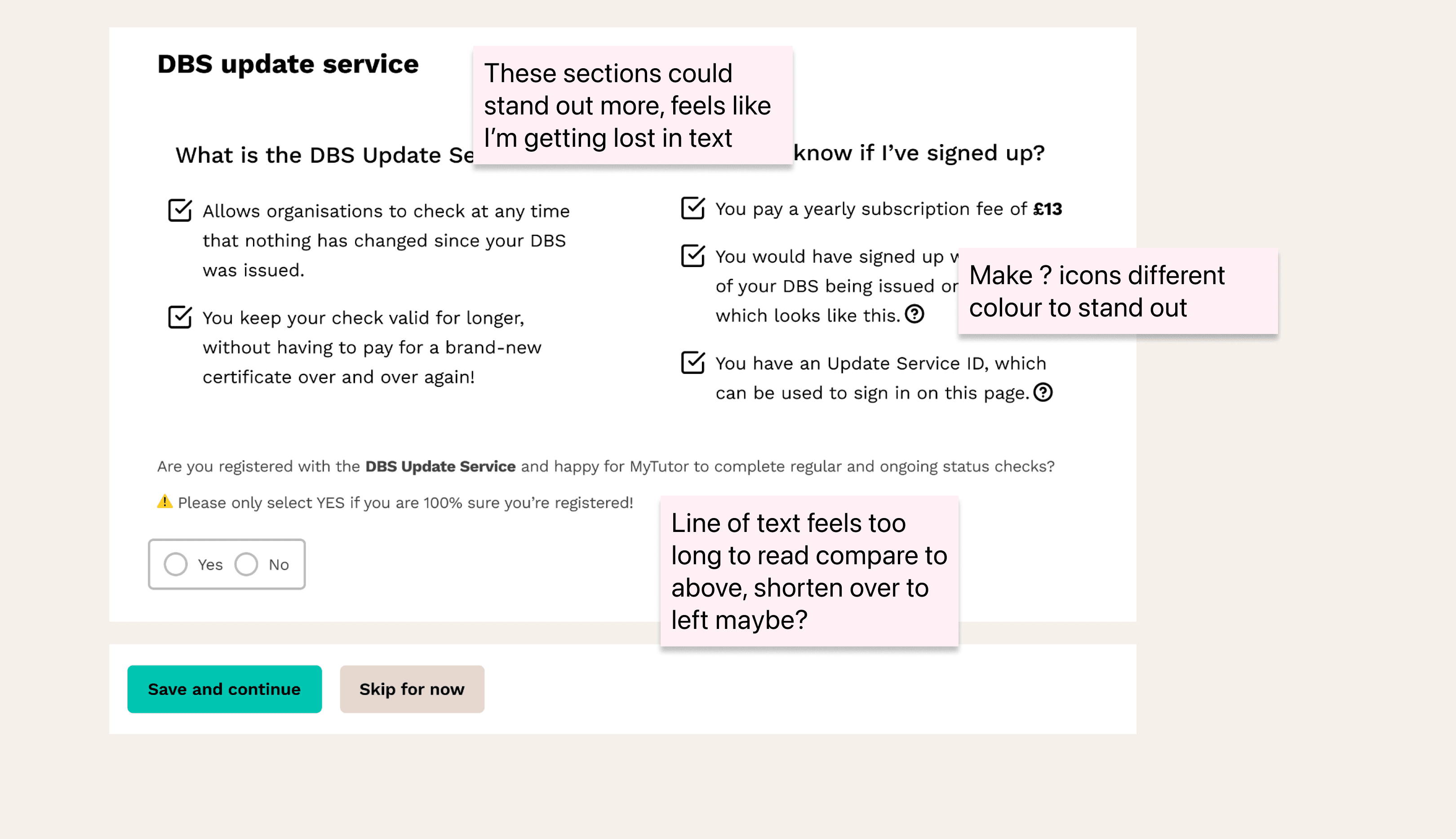
Wireframes & Initial feedback
I put together some high-fidelity wireframes and got some initial feedback from my old colleagues. Even though I’d left the company, I made sure to copy over the key parts of the design system to keep my designs aligned with what could actually be built.
👀 Clearly there was still a little room for improvement!
Out with the tooltips
While testing the tooltip concept in Variation C, I found the images had too much text for a small tooltip, making the screen feel overcrowded. Tooltips are better for short text, and they added clutter even with a darkened background. To avoid information overload, I decided to replace tooltips with modals and external links.
Final designs ready for testing
Time to test
8 participants total
From a variety of different backgrounds to ensure good representation
Split into 2 groups
Avoids fatigue and reduces bias. Smaller groups also means more focused insights
Baseline exposure of current page followed by variations
Allows for effective comparison and measured impact

Group 1 (4 participants) shown current page, then shown Variation A
Group 2 (4 participants) shown current page, then shown Variation B
💭 "Imagine you are a new tutor during your onboarding trying to figure out MyTutor's DBS requirements"
❓ Can you tell me about your understanding of MyTutor's DBS requirements based on this page?
❓ Can you walk me through your understanding of the DBS update service?
Results
Variation A performed best, and resulted in a significant increase in understanding around MyTutor's DBS requirements and the update service.
For a full test report, please click here.
Current page
🔴 Low understanding of DBS requirements and the update service.
🤔 Feedback indicated confusion due to unclear instructions and lack of visual clarity.
😰 Users found the page visually dull and hard to navigate.
Variation A 👑
🟢 High understanding of both DBS requirements and the update service.
👏 Modals were praised for being informative and visually clear.
📄 Hover image of DBS was a big hit!
Variation B
🟠 Moderate understanding but flow disrupted by opened new tabs and having to agree to T&Cs before viewing an update service page.
❓Users probably wouldn’t spend time reading all the FAQs even though they did help understanding.
What I'd do next & Key Learnings
What I'd do next
Testing showed Variation A, using a hover feature and modal popovers, was the most effective for helping users understand MyTutor’s DBS requirements.
This reinforced the importance of providing clear, in-context guidance without disrupting onboarding. I hypothesised that adding clear guidance to the Upload DBS Check page would reduce incorrect uploads, increase Update Service sign-ups, and boost tutor confidence.
If Variation A had been rolled out, I’d expect improvements in these areas and would monitor data and tutor feedback to refine the design.
Though not implemented, these insights can inform future iterations.
Key learnings
👌 Small tweaks can make a big difference
Even just change the text layout slightly can really change the composition of a page positively, I often thought good design had to completely change everything and make it swish but more often than not, the most elegant solution is the one that requires the least change to the existing system.
😎 If it isn’t absolutely terrible, probably better to just leave it
Using existing components really speeds up the design process so sometimes it’s important to let go of the urge to redesign something because really it’s just going to take the development team longer.
🤯 It's easy to get wrapped up in logistical facts
When portraying information about government requirements, it’s easy to get wrapped up in logistical facts, key learning is to remember to ask for help if I’m not sure so I don’t spend ages researching something which is hard to find!
Hefti Sports
Online ski rental facelift
Improved the winter sports online reservation flow to improve completion rates, reduce input errors, and save time in store.