Hefti Sports
Ski Rental Facelift
✏️ Independent re-design project
🕐 3 months (October - December 2024)
⛷️ Online winter sports reservation flow
Problem
Unclear instructions and limited guidance in the winter sports reservation flow lead to input errors, user frustration, and inefficiencies that impact revenue potential.
Solution
A fresh new streamlined reservation flow that makes the booking process clearer, more engaging, and easier to navigate.
Outcome
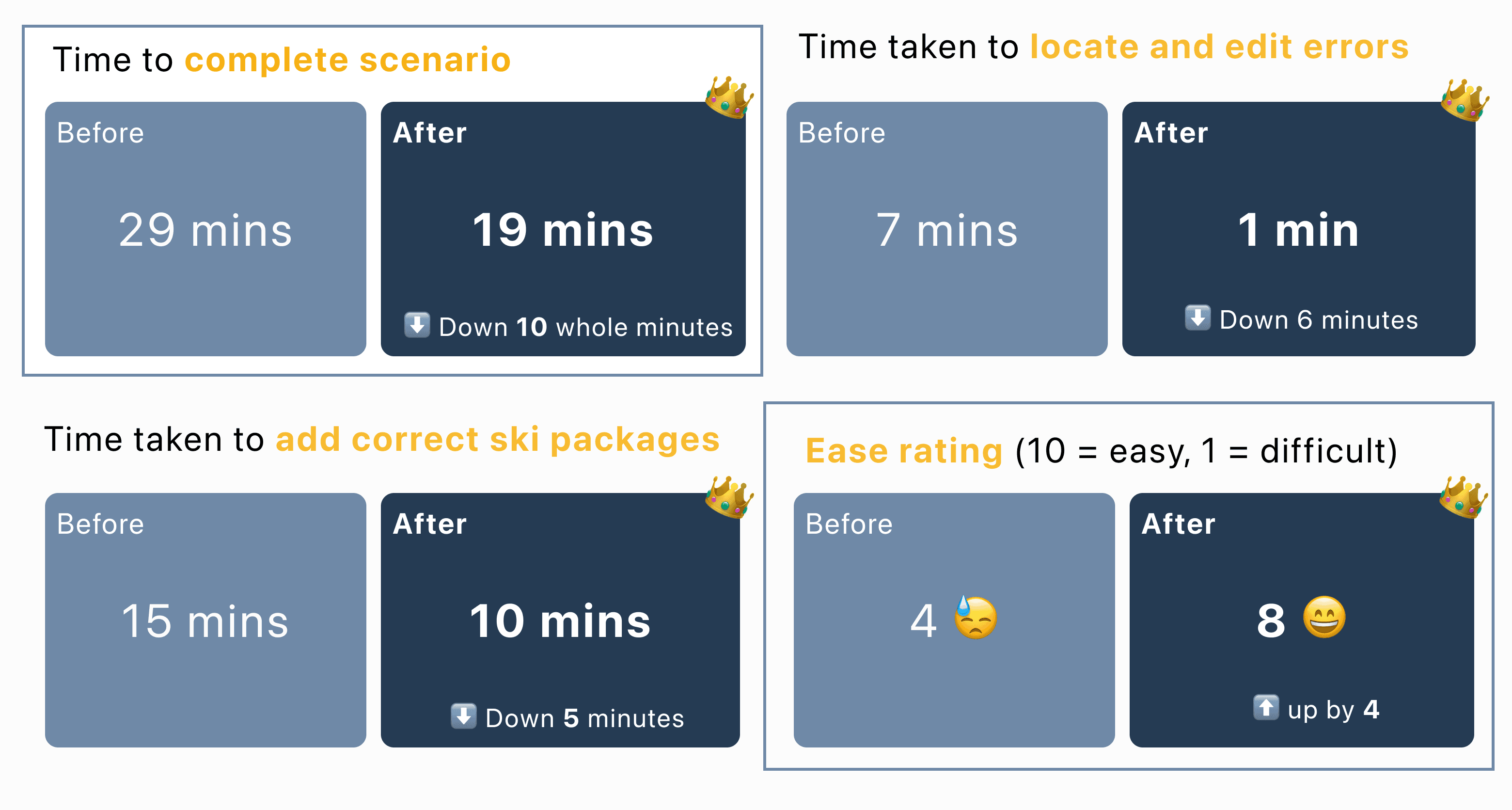
10 minutes of time saved whilst going through scenario
Ease rating increase from 4 to 8
My design process
Context
Prologue
Skiing is meant to be thrilling, but the yearly ritual of reserving skis with Hefti Sports was clouded by confusion, draining the excitement before it even began.

"If only this was designed better", I thought, squinting at the text riddled confirmation page.
That thought sparked this case study, where I reimagine the ski reservation experience to make it intuitive, stress-free,
and enjoyable for everyone, from beginners to seasoned pros.
Let's see how I got there…
Research & Planning
Understanding the problem
Hefti Sports is a ski rental shop in Leysin, Switzerland, where I grew up. They have 2 stores, one in Leysin, and one in Les Mosses. During a visit in October, I stopped by to tell them about my case study idea.

I spoke with Adam, head of reservations, who outlined some of their biggest pain points when it comes to customers reserving equipment online.
Adam first let me know that Hefti Sports uses EasyRent, an external SaaS product by Wintersteiger, a leading provider of niche market solutions.
Even though my redesign is hypothetical, knowing this from the start helped me focus on improving the user experience while keeping EasyRent’s existing structure in mind. I wanted to make changes, but not so drastic that they strayed too far from what’s already in place. This balance is important because it ensures the designs are practical and could be more easily adapted, even if they aren't implemented right away.
This interview was important because it provided valuable insights into the operational challenges and business goals that would inform the direction of my re-design.
“The biggest pain point is that 9 times out of 10 we have to manually change details like ski level, weight, height and boot size because the information they provided online is incorrect. You can imagine when we’re really busy in here how much of a nightmare that is!”
-Adam, head of reservations
Adam also mentioned that adding detailed guidance on why accurate information is needed, along with a disclaimer about binding adjustments, could improve data accuracy and protect the business. He also noted that incomplete group
details, like labelling members as “Person 1, Person 2,” slow down the in-store fitting process.
Overview of customer journey
🧑💻 Customer books equipment online
🗣️ Arrives at shop, tells staff last name
📄 Booking details come up which help guide in store process
💸 Customer pays for everything at the end of the rental period.
Usability tests of current flow
To explore and validate these insights from Adam, I carried out usability tests of the current flow with 4 of my friends who I had been skiing with.
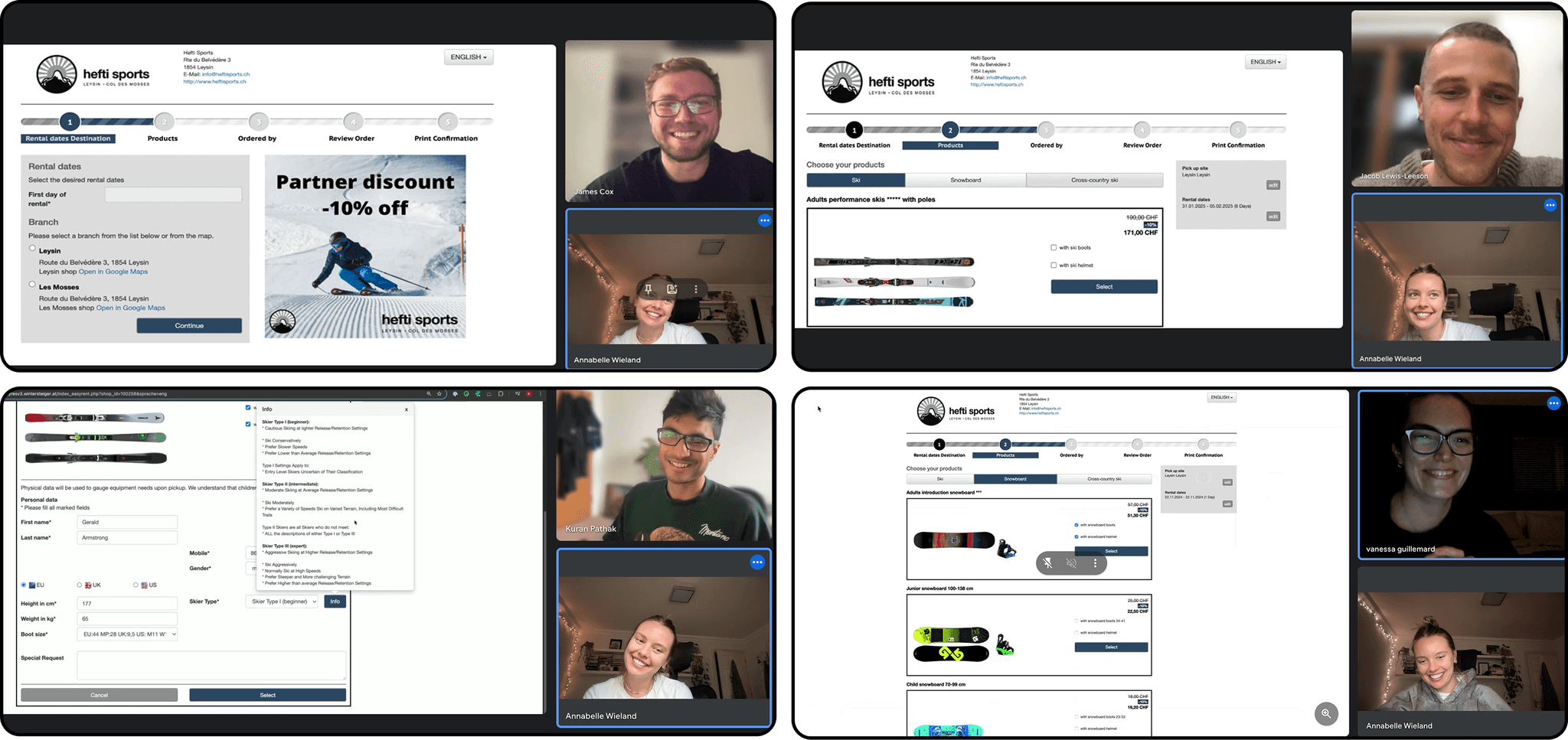
Setting the scene
I created a scenario which focuses on tasks like adding information for a group and fixing mistakes, capturing the key challenges Adam shared to make the test more relevant and useful.
💡 For this redesign, I focused only on the ski section and left out kids' skis since none of my participants were children. With just three months and being the sole designer, I had to keep the scope manageable.
If testing went well, I had more time, and the designs were actually rolled out with a whole team, I'd apply the same improvements to the snowboarding and cross-country ski sections too.
⛷️You’re booking skis online with Hefti Sports for a Christmas trip with your mum and dad to get a 10% discount. You’ve skied a few times and consider yourself an average skier. Your mum has skied once, and your dad is experienced.
As you go through the reservation flow, talk me through your thought process.
* Extras: no extras for Dad / ski boots & helmet for Mum / ski boots for you.
✍️ On the review order page…
You realise your dad’s boot size is wrong.
Update the information and explain your thoughts as you do so.
Key insights from usability tests
To establish a baseline for comparison, I measured key success metrics during user testing of the original reservation flow.
I also summarised the major issues which came to the surface.
Major issues
👎 Users had to choose a ski package before seeing information about skill levels or which package matched their experience.
👎 Confirmation page - users could not easily go back and edit details if something was incorrect, this caused a lot of stress!
👎 Too many input fields asking for information which led to fatigue
👎 Unclear instructions around booking for multiple people
Metrics
🕝 Average time to complete scenario
29 mins
🕝 Average time taken to add correct ski packages for all family members
15 mins
🕝 Average time taken to locate and edit errors from the confirmation page
7 mins
On a scale of 1-10, how easy did you find the ski reservation process?
10 = piece of cake, so easy loved it
1 = not easy at all, don't make me do it again
Average ease rating : 4
Since my redesigned flow automates data entry, traditional metrics like "time to fill out details" aren’t directly comparable. To keep testing quick, I let participants enter fake details. I focused on average completion time, error correction time, and ease ratings - key measures of efficiency, error handling, and user satisfaction, ensuring alignment with the goal of a
simpler, usable process.
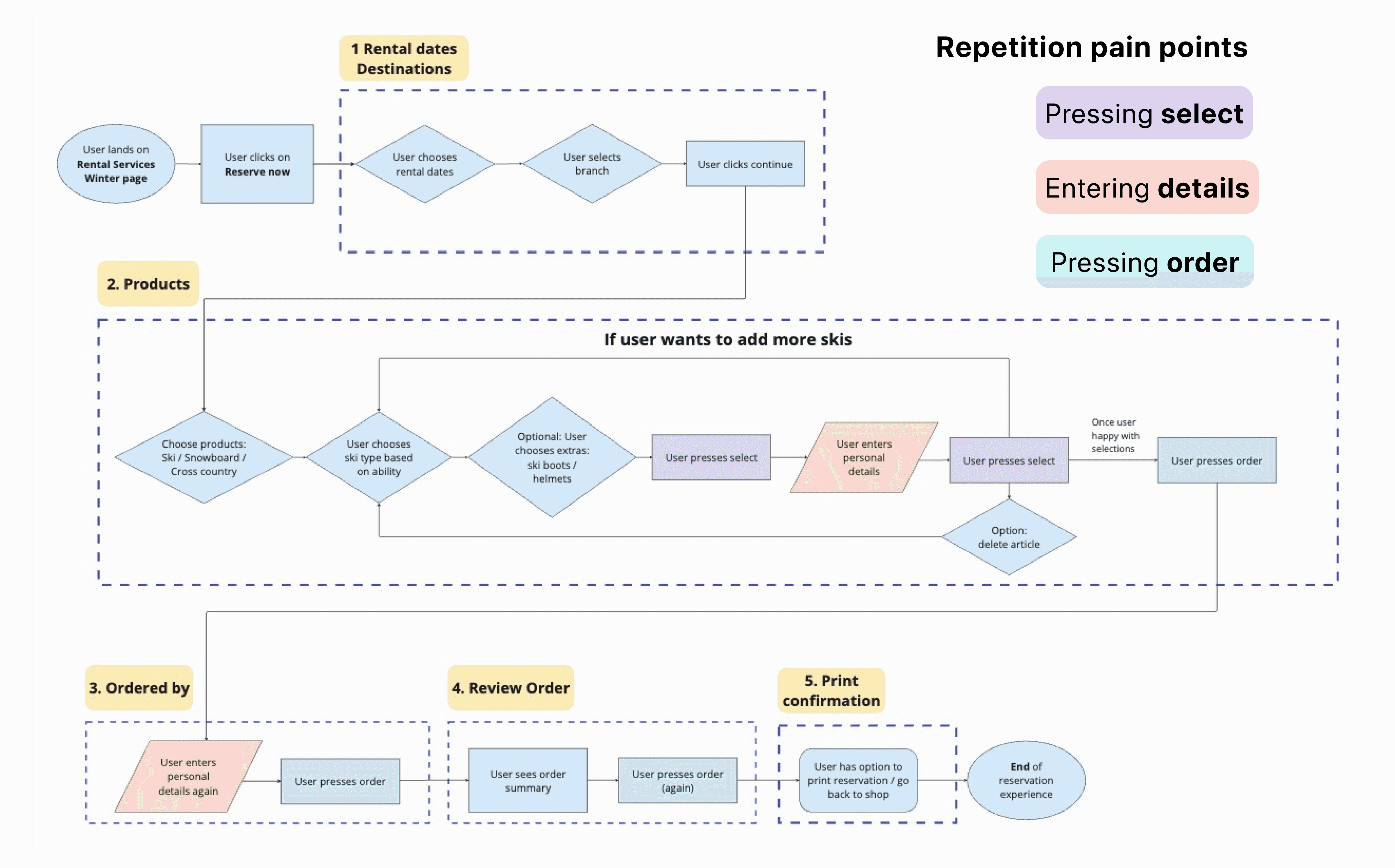
Heuristics review & visual journey diagram
I mapped out the current user flow on both mobile and desktop by capturing screenshots of all the pages, then created a visual user journey diagram. This helped me spot inefficiencies, repetition, and pain points.
Building on what I found in the first round of usability tests, I did a heuristics review, which highlighted a lot of the same issues and guided improvement ideas. You can see an overview of my heuristics review report here.

Defining my specific re-design goals
Simplify the reservation flow to ease cognitive load and improve usability.
Provide clearer guidance on the importance of entering accurate data into input fields to reduce errors and help customers input the correct information more easily.
Improve multi-person booking guidance so that fields aren’t missed out.
Improve edit functionality and show a customer info summary on the order confirmation page so users can easily amend any mistakes
Include more help and documentation and use familiar language and concepts throughout, especially when it comes to guidance for selecting the type of ski equipment.
How will I know if I've been successful?
There will be a decrease in the over all time taken to complete scenario and tasks involved, and ease rating will increase.
Competitor Analysis
Defining my redesign goals before helped me stay focused when analysing competitors.
Good thing Hefti Sports doesn’t face much competition in Leysin! For this redesign, it was worth drawing inspiration from other online booking experiences—and if Hefti ever expand beyond Leysin and Les Mosses, they can come to me for some ideas to level up the online reservation experience.


Stepper UI simplifies selecting people.
Alpine Resorts: Equipment before names improves clarity but may confuse assignments.
Skiset: Names first feels personal but adds steps.
Location & Dates: One-page keeps it clean; separation aids focus.
Ski Selection: A modal pop up with 'help me choose' would improve flow, current guide opens in a new tab.
UI & UX: Rounded inputs feel balanced and more modern.
Design
New user flow
Inspired by competitor insights, I sketched out a new user flow, focusing on adding multi-person booking guidance and making the whole process simpler and smoother.
In my first version, I kept rental dates and branch selection together on one page to keep things simple. But after chatting with a mentor, I split them up to make it less overwhelming at the start. I also switched the order—branch first, then dates—so users could see accurate availability based on what’s actually in stock at their chosen location.
This flow created a strong foundation for intuitive wireframes. The yellow post it notes highlight key changes.

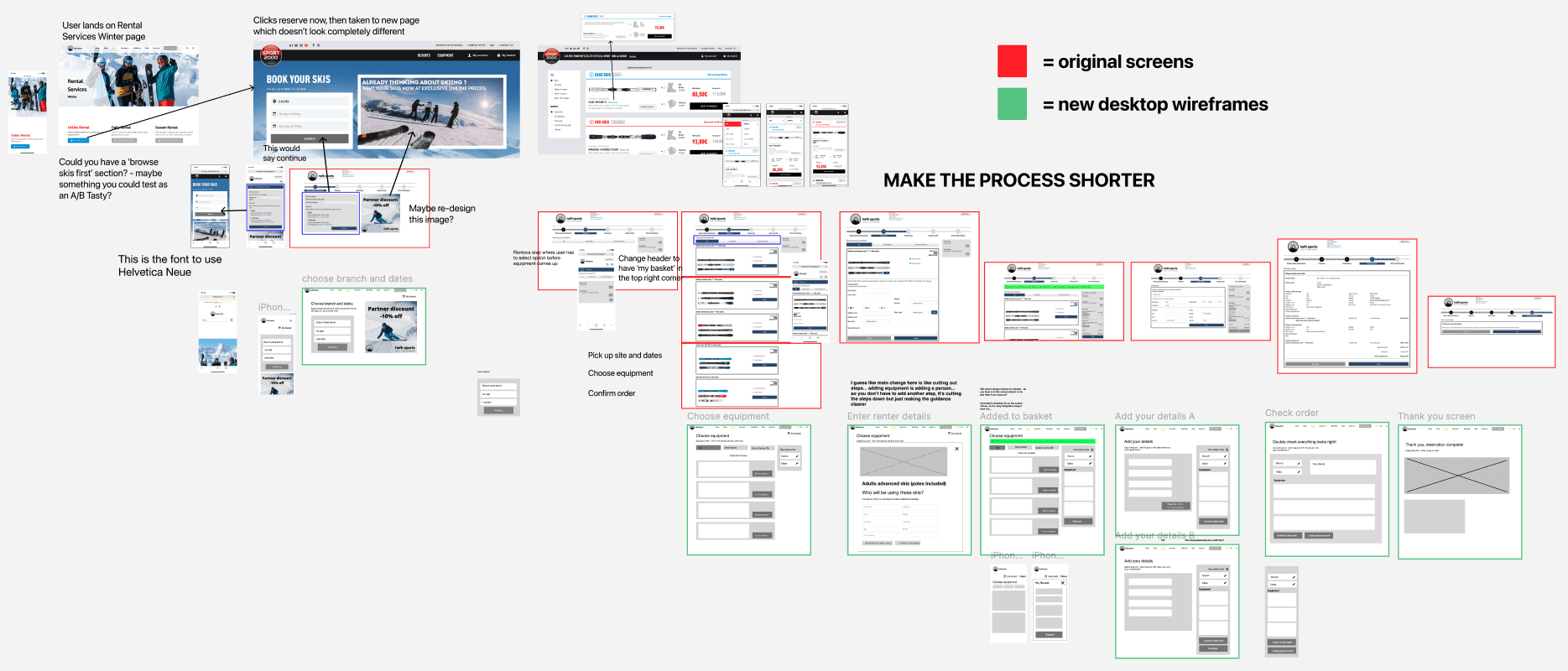
V1 wireframes & feedback
With the new user flow ready, I used Balsamiq to sketch version 1 wireframes and created a rough prototype. I started my designs on mobile to prioritise user experience on smaller screens, ensuring simplicity and functionality
before scaling up to the more complex desktop layout.
I got some initial feedback from my Mum, Dad and brother. I gave them the same scenario, prefacing that this was a very rough V1 prototype to test the over all layout and flow.

V1 wireframes ➡️ V2 wireframes
With the new user flow ready, I used Balsamiq to sketch version 1 wireframes and created a rough prototype. I started my designs on mobile to prioritise user experience on smaller screens, ensuring simplicity and functionality
before scaling up to the more complex desktop layout.
I got some initial feedback from my Mum, Dad and brother. I gave them the same scenario, prefacing that this was a very rough V1 prototype to test the over all layout and flow.


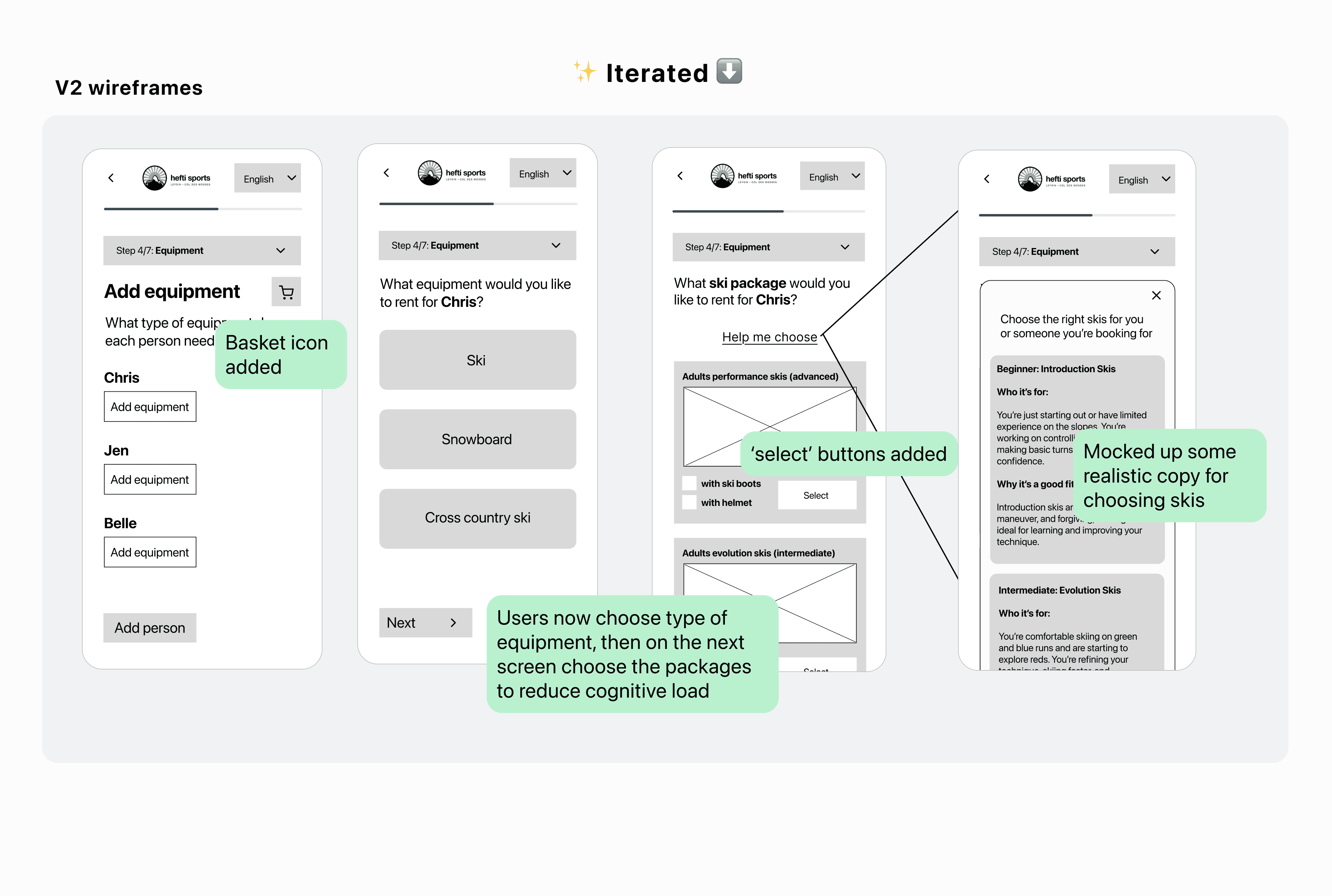

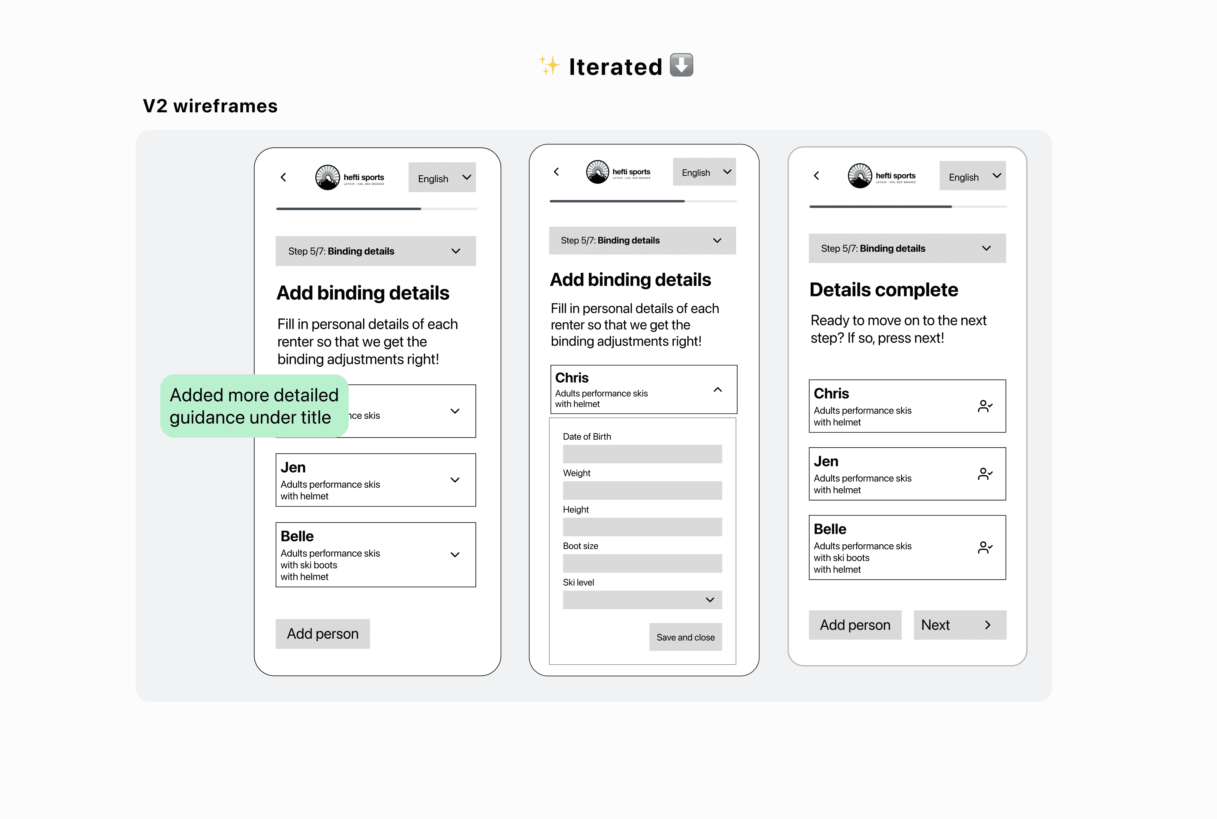
V2 wireframes usability testing
I then created a more detailed functioning prototype with my V2 wireframes and tested on 4 of my other friends who I went skiing with. In this initial testing phase, I didn't measure any metrics because I hadn't yet built out the
prototype so that users could enter information.

Key insights from user testing
“It makes sense but honestly the whole process feels way too long and I think I would have dropped off in real life. Wasn’t the original flow only 5 steps? This one now has 7 and during it I sort of felt trapped in each stage, like I couldn’t leave and come back if I wanted to because I’d be afraid all the info wouldn’t save.” 😰
“It’s cool that you can now add multiple people, but I don’t think it needs to be a whole new step because it just makes the process feel longer and more clunky, I think the copy could just be changed to be clearer.”
Back to the drawing board
😰 Although I may have made the flow clearer, in doing so I added too many steps.
I initially kept the importance of staying close to the original EasyRent layout in mind, but I’ll admit, I got a bit carried away and somewhat overlooked it while creating the first flows.
Antoine de Saint-Exupery's quote came to mind.
"A designer knows he has achieved perfection not when there is nothing left to add, but when there is nothing left to take away."
💪 We know we can never achieve perfection, but it was clear I needed to add another goal to my re-design: MAKE THE PROCESS SHORTER.
So with that in mind, I started sketching out new ideas on paper and in Figma.
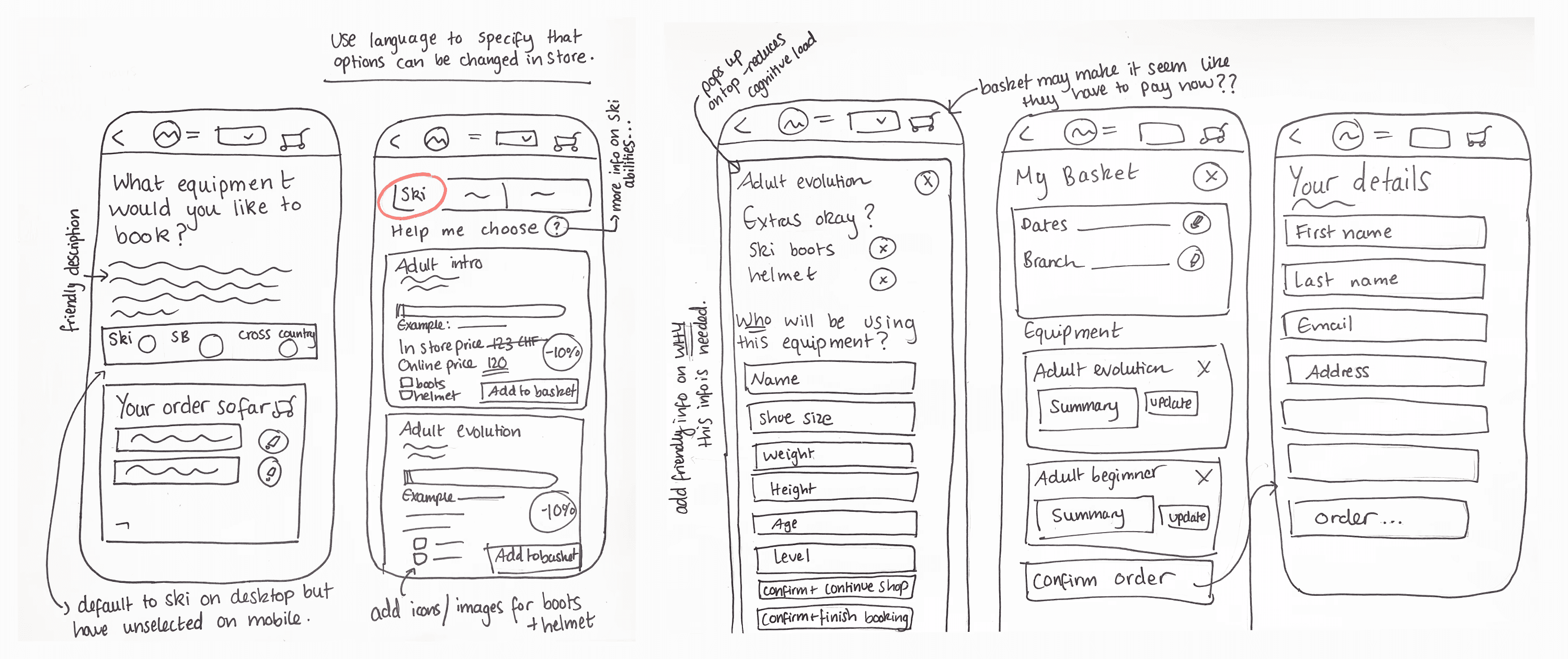
Removed progress bar so user doesn't feel trapped
Modal pops up for users to add renter details, easily can escape by clicking 'X'
Basket is also modal pop up, user can easily escape if they want to add more.
Rapid testing of new flow for mobile & desktop
I quickly developed rough prototypes for both mobile and desktop to test a new approach aimed at making the process feel shorter. Below is a screenshot of the desktop prototype.
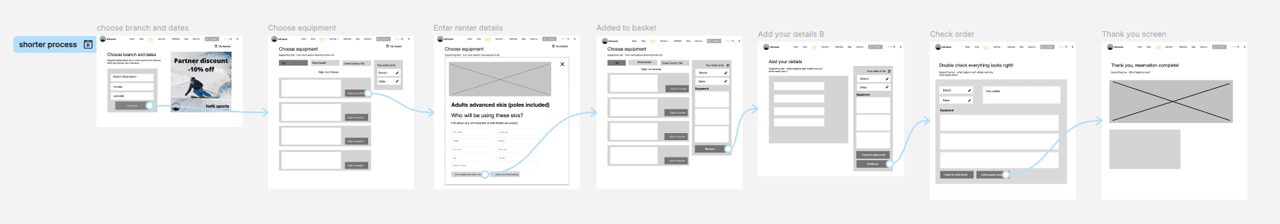
Key things I changed
🪄 Removed progress bar to prevent users from feeling stuck.
🪄 Eliminated the step for entering the number of people - instead, clear copy at the start and on buttons will guide users to add additional packages and enter details for each person.
🪄 Introduced pop-up overlays for renter details linked to each ski package, this allows users to easily exit while keeping them on the main page, making the process feel faster and more seamless.
User feedback
🗣️ "Oh yeah this definitely feels a lot shorter - the pop up overlays to enter renter information make the page feel less crowded and I feel less trapped in a long process."
AAA Design System
I created a design system that meets AAA accessibility standards (using Google Material 3 as inspiration) to lay the groundwork for my high-fidelity designs, keeping everything consistent and efficient while making sure I didn’t stray too far from the existing setup in the Hefti Sports reservation flow.
I then brought everything together into a high-fidelity prototype for both mobile and desktop, ready for user testing.
✍️ A note on renter INPUT FIELDS
I asked Adam what info Hefti Sports actually needs and found that special requests are rarely used and phone numbers are only needed for the primary renter. So, I removed both to align with my goal of simplifying the flow and reducing user fatigue. While this streamlines things, I could easily add them back if they were to become necessary.

V1 high fidelity prototype - feedback & refinement
🙋♀️ 10 participants total
4 friends I had tested original flow on
4 other friends I had been skiing with (mixed abilities)
Mum & Dad
All given same scenario (same as above)
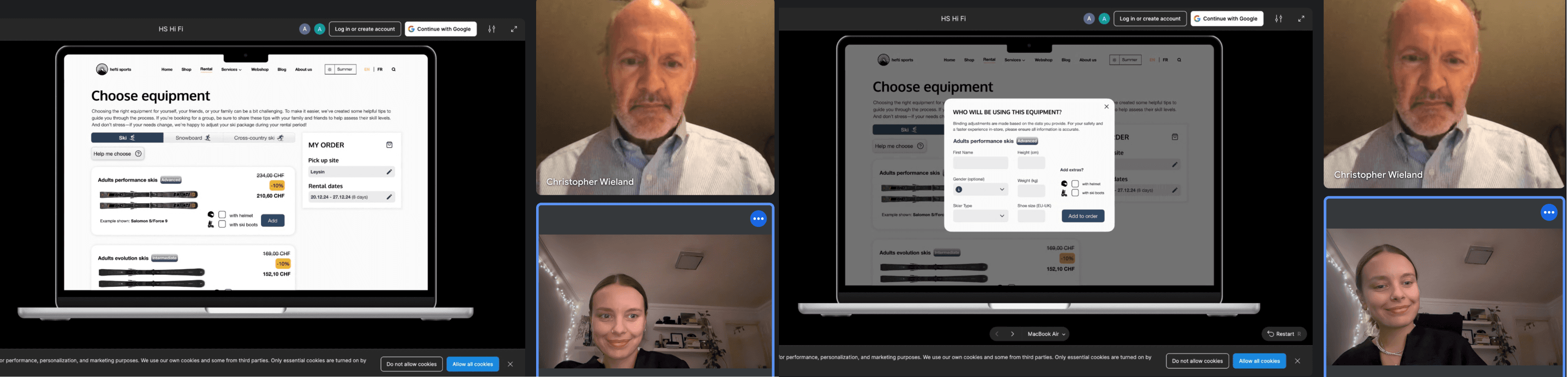
I then brought everything together into a high-fidelity prototype for both mobile and desktop, ready for user testing.
*Four participants tested the mobile version, and four tested the desktop version.
I decided to include my original test group, who had previously tested the original flow, to also test the new version. Additionally, I recruited four friends I had been skiing with (all of whom had used the flow before) as well as my mum and dad, who are also familiar with the reservation process.
If I had more time, I’d recruit a fresh group to avoid bias and get a broader range of feedback, ensuring a more balanced view of how the redesign works for different users.
I gave them the same scenario I had been using and made sure to measure my key metrics.
Tweaks based on feedback

I initially let users edit information instantly, but feedback showed the edit icons cluttered the page and distracted from key details. The original sizing of the cards also didn’t look visually appealing or neat on the page, it all looked too busy.
Widened cards and replaced inline edits with an 'Update' button that opens an overlay, reducing clutter and making errors easier to spot.

Fixed formatting of ski cards to make sure they were consistent and worked in prototyping mode.
Changed title to lower case, put important information in bold to make it stand out
Rounded corners of overlay to match laptop breakpoint
Increased padding on either side and fixed any text that was spilling out (EU/UK)
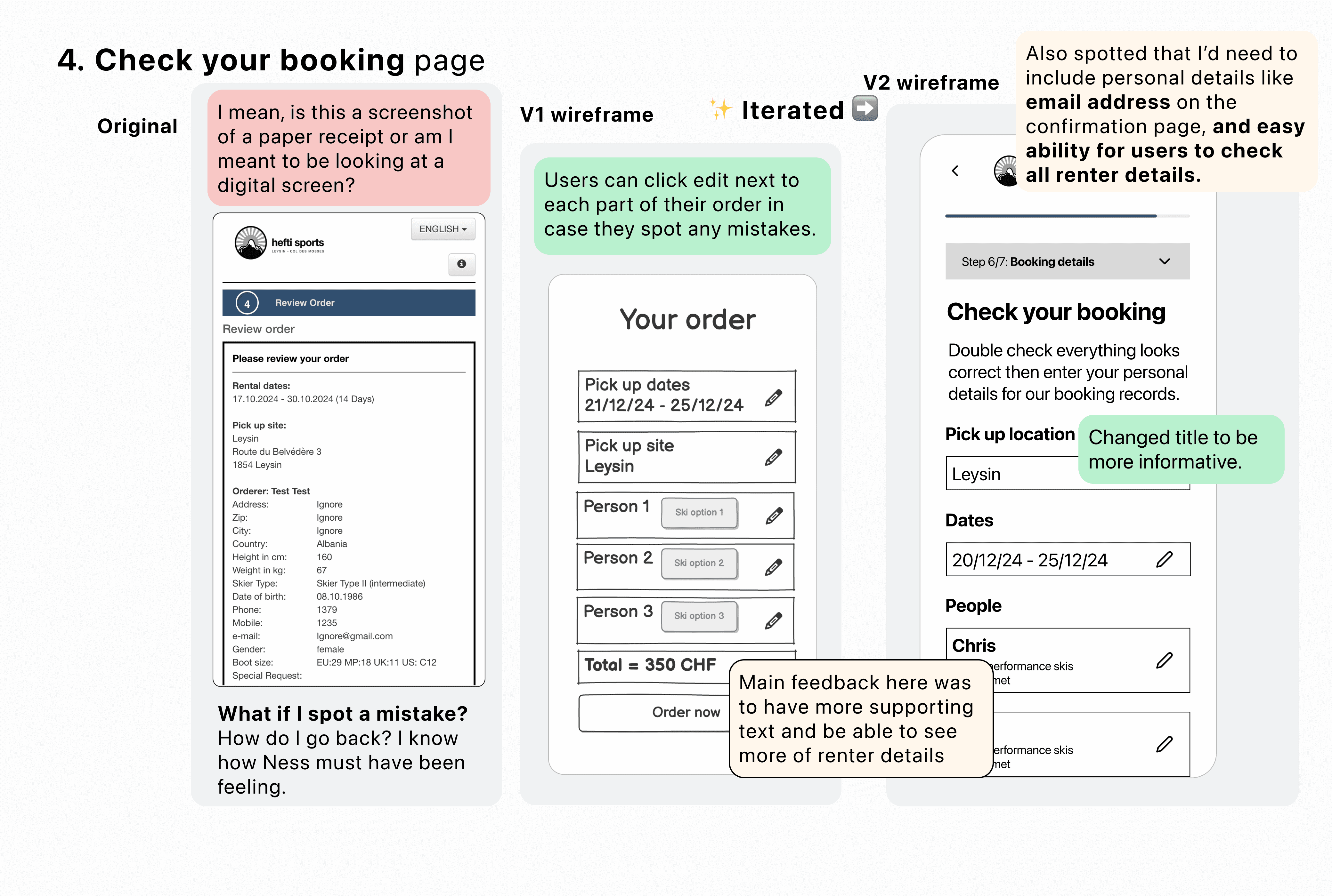
Original screens & newly designed screens
Pick up location & Rental dates
Before
Clicking the "Rent Online" button redirects users to the EasyRent reservation flow, which feels disconnected from the main website. This lack of cohesion may lead to confusion and distrust.
After
The process is more seamless—users can select their branch and rental dates immediately, eliminating an extra step. Clear guidance improves the experience, and the reservation flow now aligns visually with the main site, enhancing trust and consistency.
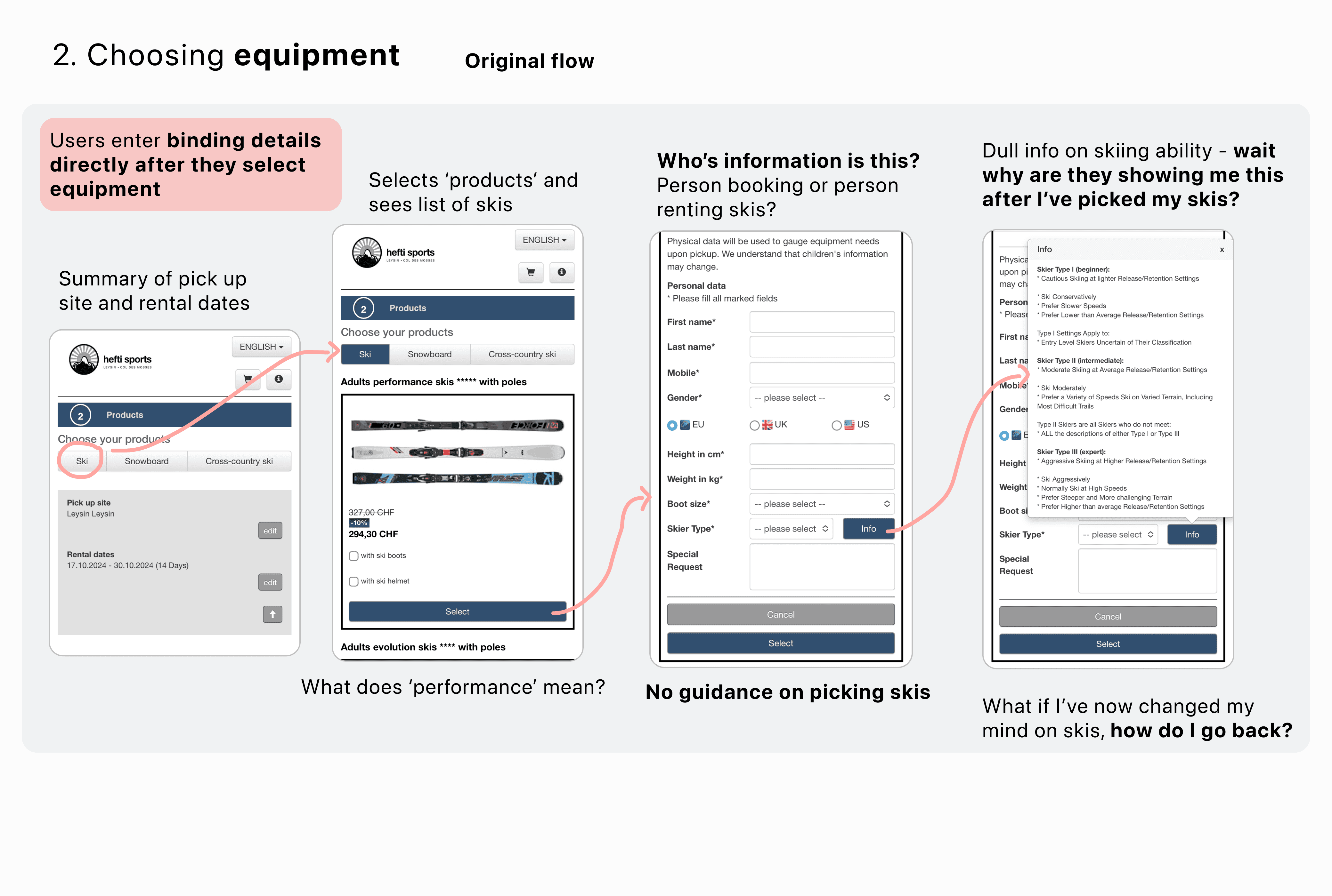
Choosing equipment & adding renter details
Before
9 drop down input fields lead to fatigue and make page look crowded.
No helpful guidance on which ski package to choose, or emphasis on importance of entering correct information.
After
‘Help me choose’ modal pop up
Fewer input fields structured in an overlay which users can easily escape from.
Information tooltip on why they ask for gender, and options updated to be inclusive.
Confirm order
Before
Information small and very hard to read.
If mistakes are spotted, user has to click ‘backward’ through the whole flow to rectify. If mistake in renter details, user has to delete all info and start again.
After
Information laid out in neat sections.
Guidance on how important it is that information is correct.
All renter details clearly laid out with option to update there and then.
Was my re-design a success? YES.
Soundbites from Hefti Sports team
"Wow! This looks so cool! It definitely looks more modern and visually appealing and the copy reads so much clearer. I also really like how users can now easily edit things on the confirm order page, I think that's one of the best improvements because before it was super hard to read. I also like how it still feels like our brand! Great job, I'm going to see if we can easily implement some copy changes inspired by this with the EasyRent software."
What I'd do next & Key Learnings
What I'd do next
Fix minor prototyping issues for consistency.
Incorporate more user testing feedback.
Ensure AAA accessibility (resize small buttons).
Expand the design system to cover more scenarios (e.g., snowboarding & cross-country).
Run A/B tests to refine user guidance.
Plan for multilingual support.
Present final designs with test data to Wintersteiger, emphasizing quick wins like copy tweaks and overlays for cost-effective UX improvements.
If my designs were implemented
I’d track key metrics to assess impact and identify areas for improvement:
📊 Data Accuracy & Staff Efficiency – Monitor manual corrections (e.g., ski level, weight, boot size). A decrease would confirm fewer errors and time saved.
📉 Completion Time & Drop-off Rate – Track booking time and abandonment points. A faster flow with fewer drop-offs signals a smoother experience.
🗣️ Customer Satisfaction & Support Queries – Measure changes in feedback and support requests. Fewer inquiries indicate improved clarity and ease of use.
Key learnings
💡 Clear UX writing is key – Well-crafted instructions reduce errors, improve accuracy, and streamline operations, proving that great design is as much about communication as visuals.
💡 Guidance is a balancing act – Too much overwhelms, too little leads to mistakes. The key is offering help at the right moments without slowing users down.
💡 Small tweaks, big impact – Simple changes like reordering fields or improving input guidance can significantly enhance the user experience.
Next time
I’d deepen my research by testing with real customers and analysing Hefti Sports’ user data to uncover booking behaviours and pain points. Interviews would provide key insights to refine the flow.
Collaborating with Hefti Sports staff would help identify problem areas using real data and improve my understanding of their backend system to enhance both UX and operations.
Lastly, I’d engage with Wintersteiger to assess implementation feasibility, understand past roadblocks, and identify technical or business constraints.
Tfl Go
Station history feature addition
Added a feature to the TfL Go app where users can access in the moment historical context about tube stations and the surrounding area.