TfL Go
Tube stop history feature addition
✏️ Independent design project
🕐 1 month (Jan - Feb '25)
✨ App feature addition
Problem
Commuters and tourists using apps like TfL Go lack an in-the-moment feature to quickly search for historical context, local highlights, and station origins, missing opportunities to engage with London's cultural landscape during their time on the tube.
Solution
Search feature addition into TfL Go that allows users to instantly access packaged historical context, local highlights, and station origins, enriching their commute with seamless, in-the-moment insights.
Outcome
New feature successfully engaged all participants, with 100% discovering and exploring the historical context of multiple stations.
Users found it intuitive, with an average satisfaction rating of 8.5, and expressed strong interest in using it again.
My design process
Context
Prologue
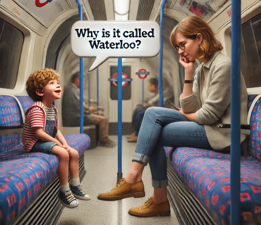
"Why is it called Waterloo?", a little boy on the tube asked his mum. She glanced up from her phone and said, "I don’t know, darling. We’ll check later."
He tried again as the speaker announced, "Next station: Embankment."
"Mum, why is it called Embankment?"
She sighed, "I’m not sure."
As they hurried off, I couldn’t help but wonder: Why is it called Waterloo? And will they ever look it up?
That day on the northern line sparked the inital idea for this case study: Imagine if there was an app that people could use to get on the go insight about the historical context of London underground stops?
Research & Planning
Would people use an app like this?
To kick things off, I created a survey and shared in facebook community groups, on social media, and within my network.

Unfortunately, I only got 8 responses! 😥 Recruiting for user research was a challenge here because of the short time frame I was on, but from these 8 responses one thing was clear: people were interested!


To get around the challenge of only getting 8 responses, I decided to deepen my research by posting in the r/London community in Reddit.

I was actually thrilled with the response and considered becoming a reddit influencer. (🤫)
Top comments
(if you're interested in reading the whole thread please click here.)

Tourists and history enthusiasts might enjoy a Tube station insights app, but most commuters prefer not to download a standalone app. Suggestions included integrating the feature into Citymapper or TfL Go, or offering it offline. Key takeaway: convenience matters.
Pivoting to feature addition rather than stand alone app
My original idea was to create a stand alone app, but my research indicated people would prefer it as a feature addition.
I loved this idea because it means I could tap into an existing user base and if implemented, I wouldn't have to build an
audience from scratch.
TfL Go is the app I use the most, and it has the simplest design, so I decided to go with that!
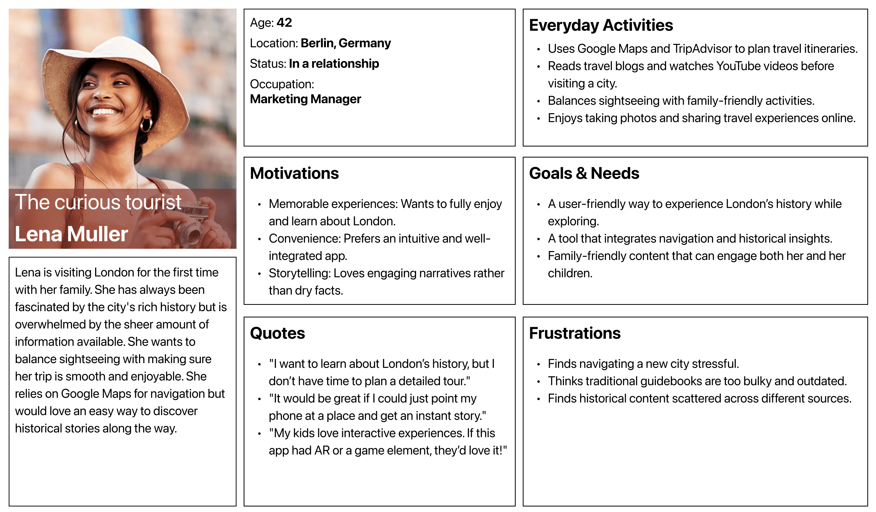
User personas
Off the back of the comments on the reddit feed, I used AI to help me create 3 user personas.
Why? To better understand the diverse needs and expectations of potential users. This helped me identify key challenges they face and ensured my design decisions were aligned with what they truly want from the app.


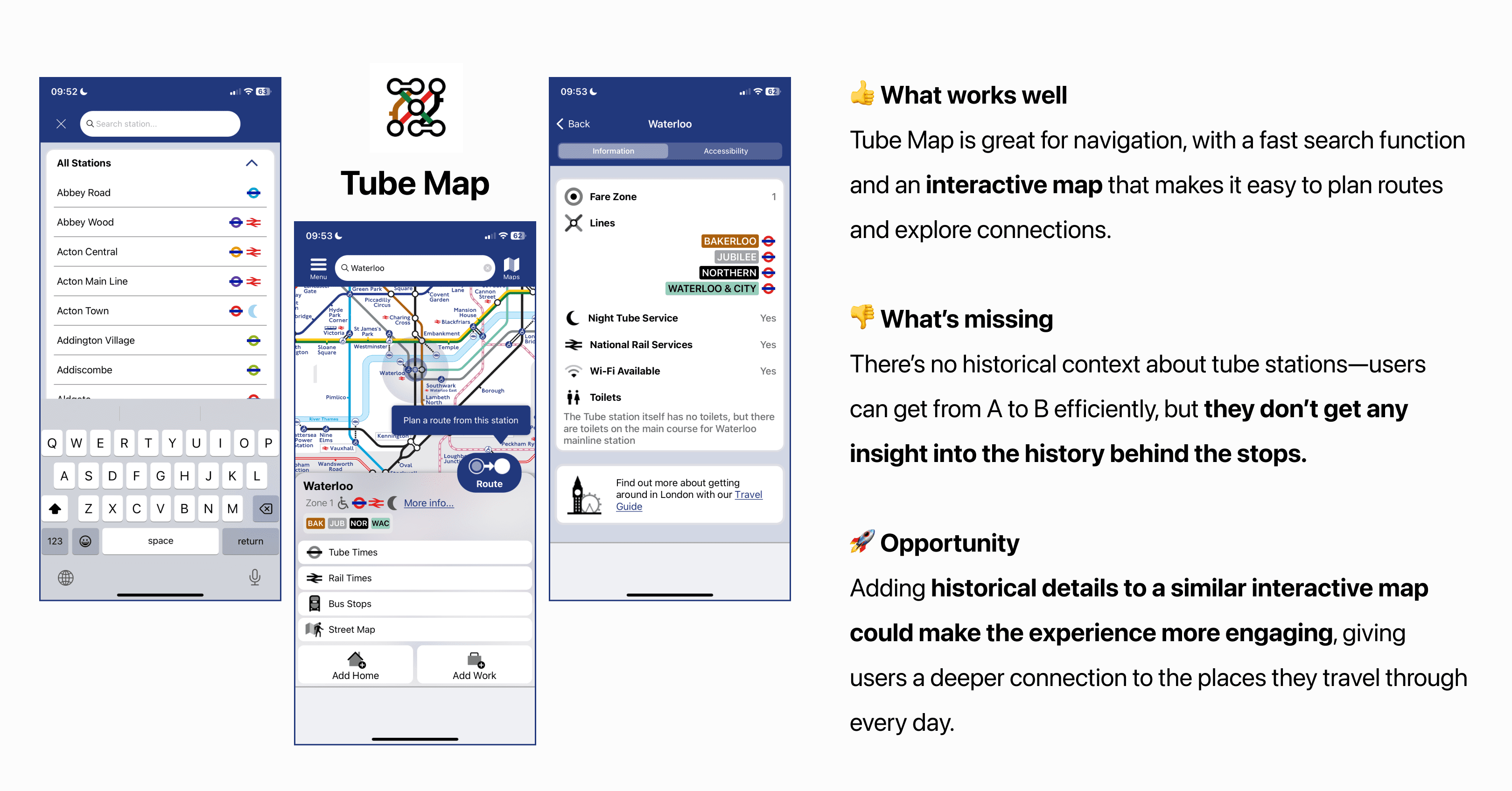
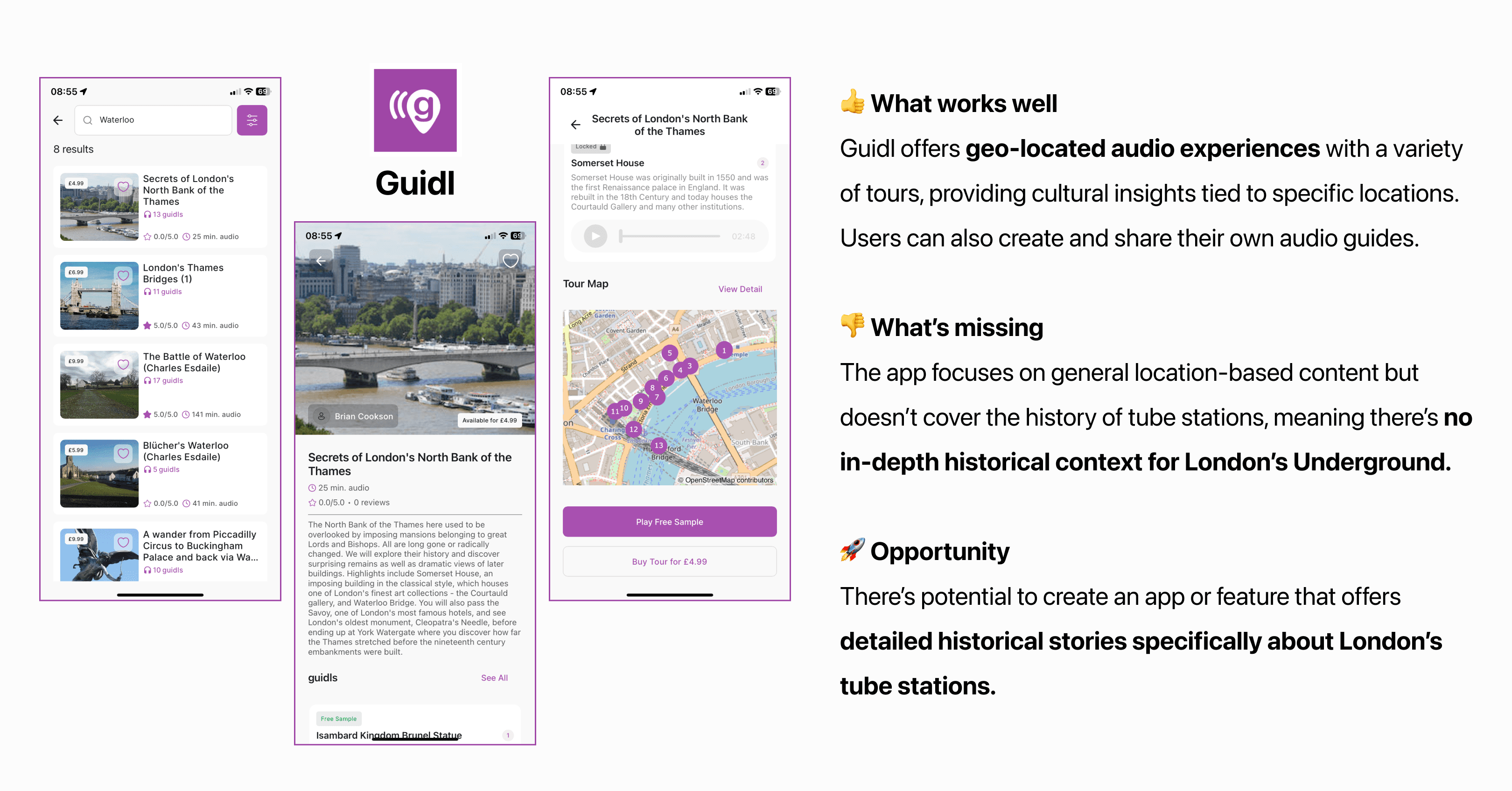
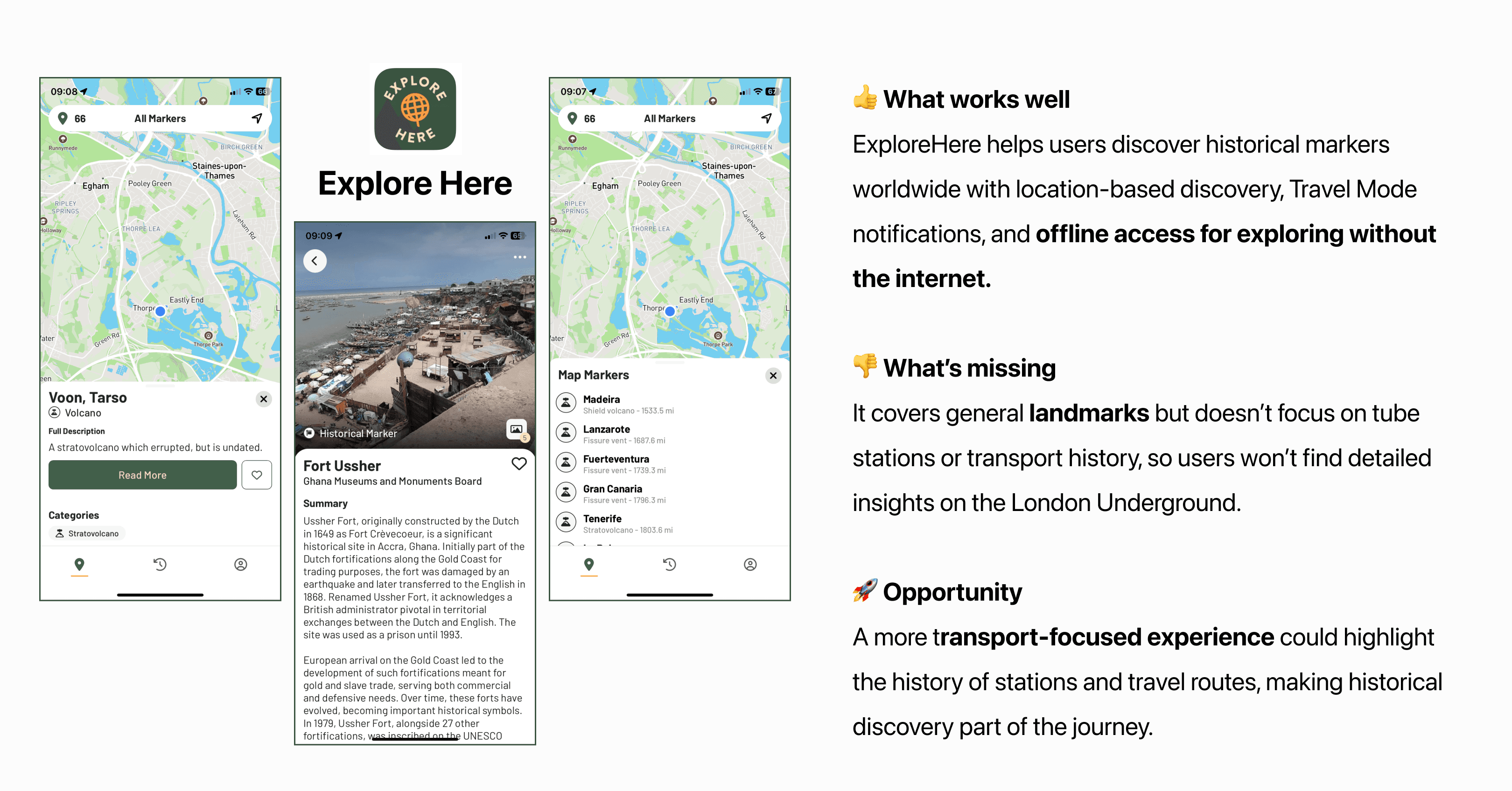
Competitor Analysis
While Transport for London (TfL) Go provides real-time travel updates and journey planning, there is currently no standalone app dedicated to exploring the historical context of London’s tube stations.
Many Underground stops have rich histories, but this info isn’t easily accessible in travel apps. This presents an opportunity to enhance TfL Go with historical insights. To explore this, I conducted competitor research on how similar apps present
information and engage users.

Design
Observing existing patterns
Since this was a feature addition, I ensured my designs aligned with TfL Go’s existing patterns for a seamless user experience. I analysed the app’s navigation to integrate a feature that provides easy access to historical context on station names and local highlights.
Clicks on card -> Title page -> More information

Clicks on station names -> Show information -> Scroll station information

I designed user tests using existing patterns while adding station history, ensuring a quick and efficient solution within my one-month timeline. This let me add context without disrupting the experience, making it easier to assess user engagement.
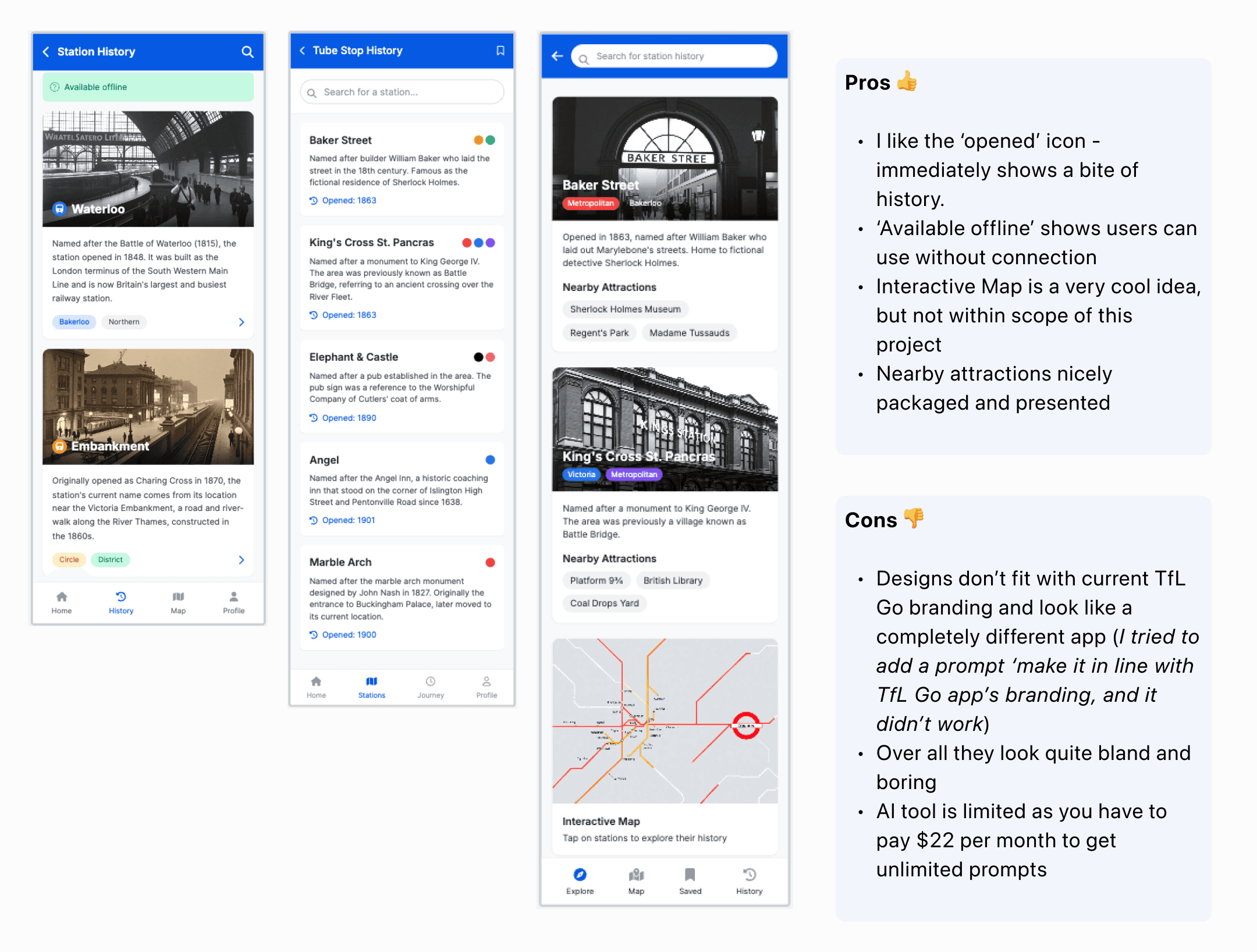
Help of AI
I used UX Pilot to get some inspiration for high fidelity UI designs.
✨ The prompt
A feature addition to the TfL go app which allows users to look up the historical context of London underground
stations. Users can access this feature offline, and the information is packaged up nicely. Include examples for waterloo and embankment, including historical context behind these station names. include 5 examples, images, and also include a map view and stuff you can do around that area.
✨ The Result (with some pros & cons)
Rough sketches
To get some ideas flowing, I took to pen and paper and sketched out some rough ideas for how the feature addition could look. I focused on the 2 design ideas I had thought about before, aware that they would likely iterate as I tested.
If I had more time, I would have developed a rough prototype in Figmato gather early user feedback on the functionality. However, given that this was a straightforward feature addition using existing patterns and an established design system, and considering the small scope of the project, I opted to move directly into high-fidelity designs.

Hi Fidelity Designs
For this project, I chose to focus on just 10 London Underground stations with interesting name origins.
Since the whole project only ran for a month and I didn’t have a lot of time, keeping it to a smaller number made the research more manageable while still ensuring each station had a great story behind it. This way, I could dig deeper into the historical, cultural, or linguistic meaning of each name, making the insights more engaging and meaningful.
Presenting station names
I decided to mock up card versions which included graphic images similar to the small cards in the existing app (EG: Lunar New Year & New year) and just station names without images (mimicking how they currently appear when a user enters a location, to save time I screenshotted existing app).
At first, I considered using images of the stations as the card backgrounds, but I quickly realized it looked inconsistent and didn’t match the polished feel of the existing app. Finding high-quality images for all 10 stations that worked well together would also have been time-consuming. Seeing the lack of cohesion, I quickly pivoted to a different approach.
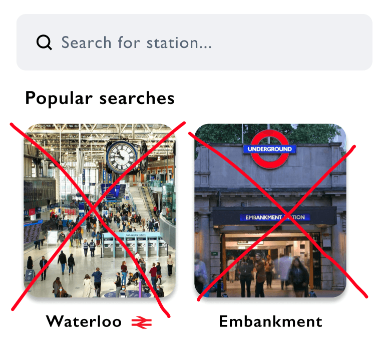
After searching for images on Google and browsing stock photos on Unsplash, I realised that the best way to achieve the look I envisioned was to design the graphics myself in Figma. This allowed me to stay true to the app’s existing brand feel while ensuring all the cards remained visually consistent.
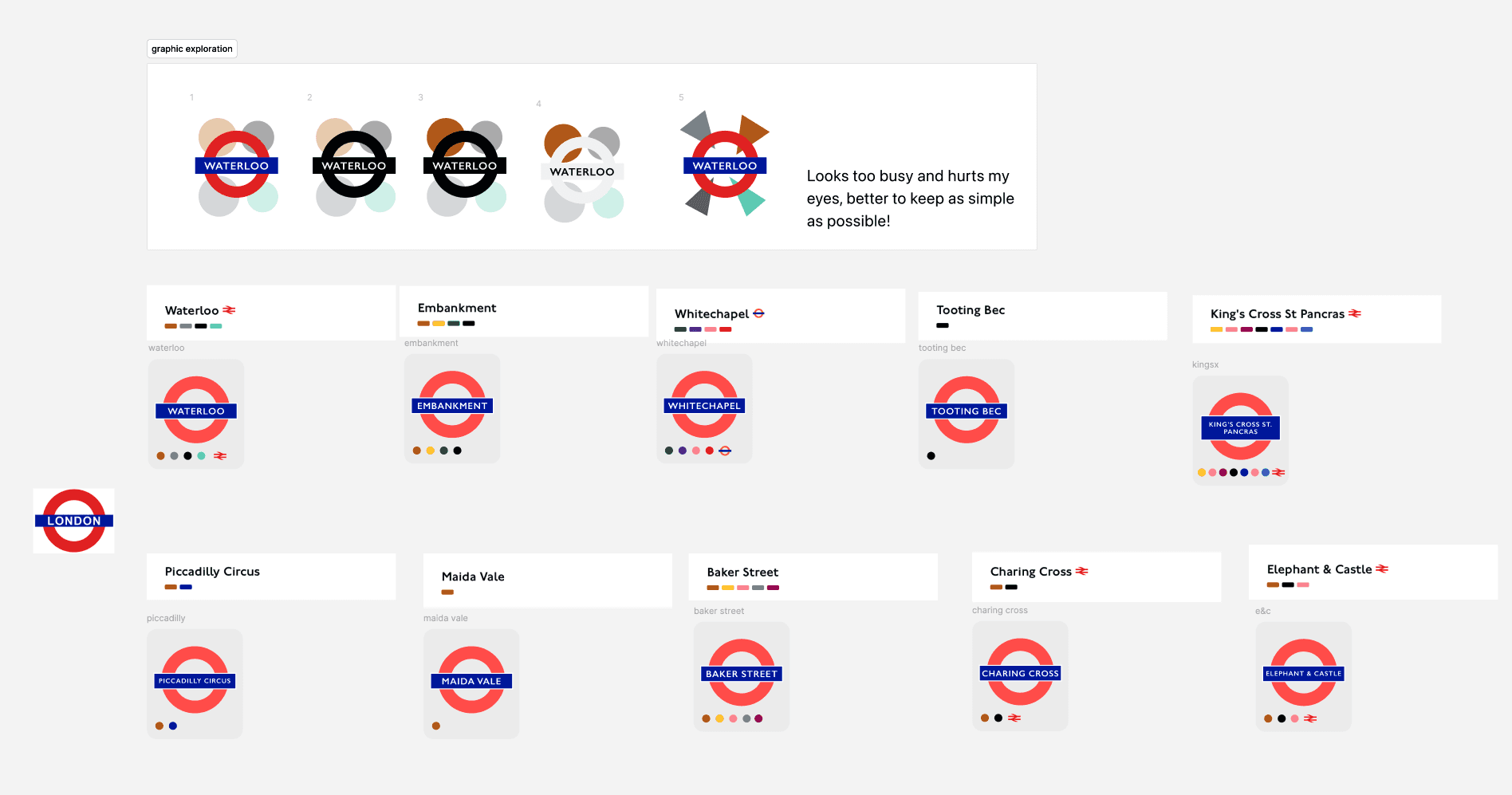
As you can see in the above image at the top, I had a go at creating funky graphics but they ended up just looking too busy.
If I had more time, I would have designed graphics in this style—curating images of key landmarks or themes tied to each
station and enhancing them with bold colors and dynamic shapes to make them stand out.
Final designs ready for testing
Users can access the feature via a new menu option or within ‘Where To.’
Tapping ‘Show Information’ on a station reveals a ‘Station History’ link, ensuring easy discovery and seamless integration.
Path 1 : through existing where to feature
Path 2 : through 'tube stories' menu addition
User testing
5 participants in total
I recruited 5 participants: 3 regular commuters and 2 tourists, to get a good mix of feedback on the feature. The commuters were familiar with the Tube and the TFL Go app, while the tourists gave me insight from a less frequent user’s point of view.
Scenario
You’re on the tube, heading through London, when you suddenly wonder why ‘Waterloo’ is called Waterloo.
You remember that TFL Go has a new feature that lets you explore the history behind station names, so you decide to open it up and search for the history of Waterloo. After reading about it, you’re intrigued and decide to explore the history of 4 more stations that catch your interest.
Success metrics & Results

What I'd do next & Key Learnings
What I'd do next
Enhance visual content: Incorporate more images, interactive maps, and visual elements to balance the text-heavy information and improve user engagement
Implement save and share features: Add functionality for users to save favourite historical information and share it with friends, enhancing the social aspect of the app
Expand coverage: Explore the possibility of including information about national rail stations and other historically significant locations beyond the London Underground.
Integrate AI recommendations: Investigate the potential for AI-driven personalised recommendations to suggest relevant historical sites or stations based on user interests and behaviour.
Develop real-time information: Explore ways to incorporate current events and real-time updates related to the areas surrounding each station, providing a more dynamic user experience
Key learnings
User testing is invaluable: Even with a small sample size, user feedback provided crucial insights for future improvements and feature ideas.
Existing design patterns are effective: Following the app's established layout and information structure helped create an intuitive user experience.
Users desire interactive and personalised experiences: Feedback indicated a strong interest in more interactive elements and personalised content.
Time constraints impact feature depth: The limited project duration restricted the ability to implement all desired features and iterations.
Cross-cultural potential exists: User interest in similar features for other countries suggests potential for broader application of the concept.
If approaching the problem again, I would…
Prioritise User Research & Iteration: Allocate more time for extensive user research with a diverse group and structure the timeline for multiple rounds of testing and design iterations. This ensures designs are responsive to user feedback.
Integrate Visuals and AI Early: Incorporate visual elements and explore AI-driven personalisation from the initial design phase. This proactively addresses the need for engaging content personalised user experiences.
Involve Subject Matter Experts: Collaborate with historians or local experts to guarantee the accuracy and depth of the historical information provided.